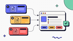
Done well, it shows exactly which button to click and what the screen should look like when they get there. Done badly, it decays into a gallery of images that no longer match the product.
This guide explains how to capture, annotate, organize, and maintain documentation screenshots so they stay accurate instead of drifting out of date after the next release. The challenge is not taking screenshots; it is keeping them true as the product changes. That maintenance problem is the same one behind the hidden cost of poor process documentation.
The fix is to standardize how you capture, annotate for meaning rather than decoration, and tie every image to a review cadence that treats every UI change as a recapture trigger. For teams looking to reduce manual recapture, see our guide to capture-first workflow documentation without typing.
Key takeaways
- Screenshot documentation removes ambiguity by showing users exactly what they should see at each step.
- A documentation screenshot should combine clear instructions, focused annotations, alt text, and version metadata.
- Consistent capture standards, cropping, and annotation styles make screenshot documentation easier to read and maintain.
- Treat every UI change as a review trigger by assigning owners, review dates, and recapture workflows.
- Screenshots work best for static interface states, while screen recordings are better for workflows that depend on motion.
What is screenshot documentation?
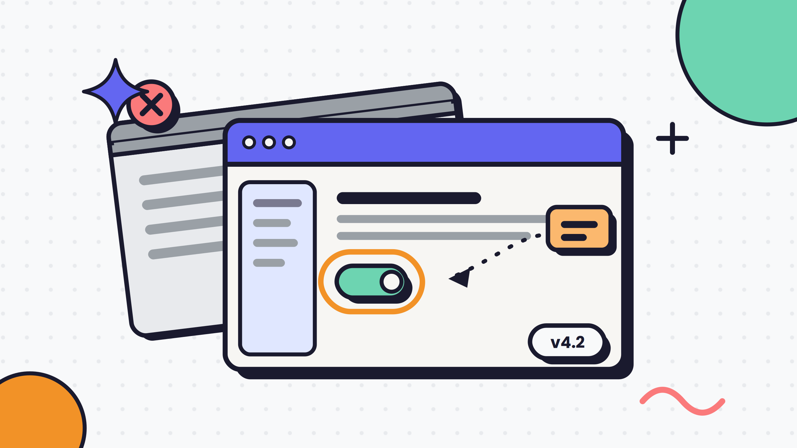
Screenshot documentation is the practice of using captured images of a software interface to show users what to do and what they should see at each step. It pairs a written instruction with a picture of the exact screen the reader is looking at, so there is no gap between the words and reality.
A good documentation screenshot is not decoration. It is evidence. It confirms the reader is in the right place before they take the next action. That confirmation separates a user who follows a guide with confidence from one who second-guesses every click.
The catch is that screenshots are cheap to take and expensive to keep true. The moment the underlying UI changes, an anchored screenshot becomes wrong, and a wrong screenshot is worse than none: it tells the reader to trust something that no longer exists.
Why screenshot documentation matters in software documentation
Text alone forces the reader to translate your words into their screen. A screenshot removes that translation step. It shows the reader the exact state they should be in, which reduces the ambiguity that causes support tickets and abandoned tasks.
Consider a common admin task: reset a customer's multi-factor authentication (MFA). Written as prose, "navigate to the security settings and disable the second factor" assumes the reader already knows where security settings live and what the toggle is called. Pair that sentence with a screenshot of the actual admin console, a callout ringing the exact toggle, and the ambiguity narrows sharply. The reader stops guessing and starts doing.
The value is real, but it is conditional. A screenshot only helps while it is accurate. The moment it lies, it does damage. That is why screenshot documentation is a discipline, not a decoration budget.
Core components of a screenshot doc
A screenshot doc is more than the image. Each documented step is a small unit with a predictable shape, and skipping any part of it is where guides start to fail.
Anatomy of a documented step
- Instruction text: The action in plain language, written before the image so the reader knows what they are looking for.
- The screenshot: The captured screen showing the exact state the instruction describes, cropped to the relevant context.
- Annotation: A callout, arrow, or highlight directing attention to the one element that matters for this step.
- Alt text: A written description of the screenshot for screen readers and for readers whose images fail to load.
- Version metadata: A last-captured date or release tag so an owner can tell at a glance whether the image is current.
The image without the instruction is a puzzle. The instruction without the image is the old problem you were trying to solve. You need both, plus the metadata that lets someone verify freshness later.
Screenshots vs. screen recordings
Static screenshots and screen recordings solve overlapping problems, and the right choice depends on what the reader needs to do, not on which is more impressive.
| Factor | Screenshots | Screen recordings |
|---|---|---|
| Best for | Scanning, referencing a step, confirming one screen state | Genuinely motion-dependent flows |
| Searchable | Yes | No |
| Reader controls pace | Yes, jump to any step | No, must scrub the timeline |
| Update effort | Recapture one image | Re-record the sequence |
| Ideal use | Most software documentation | Drag-and-drop, multi-panel animation, timing-sensitive sequences |
Use recordings for the handful of steps that truly need motion, and screenshots for everything else. For guidance on assembling these into a full walkthrough, see our guide to writing clear work instructions.
Best practices for documentation screenshots
Good documentation screenshots come from standards applied the same way every time. The three practices below cover capture quality, framing, and the maintenance discipline that keeps everything from rotting.
Capturing high-resolution, consistent screenshots
Inconsistent screenshots read as sloppy even when the information is correct. When one image is retina-sharp and the next is a blurry half-window at a different zoom, the reader notices the seams and trusts the guide less. Lock your capture settings before you take the first image, and hold them across the whole document set.
Capture standards to lock
- Resolution and scale: Capture at a consistent, high resolution with fixed device scaling, so text stays crisp when the image is embedded and resized.
- Viewport size: Use one browser or window size for every capture so elements land in predictable places across screenshots.
- Theme and state: Pick light or dark mode and stick to it. Use a clean demo account without notification badges or half-finished data cluttering the frame.
- Redaction rules: Decide up front how you blur or mask customer names, emails, and account numbers, and apply redaction-by-default so no real data leaks into a published guide.
- Zoom level: Keep the application at 100 percent zoom unless you are deliberately showing a zoomed detail.
Consistency is the point. A reader should never be able to tell that three different people captured the images in a single guide.
Cropping and framing the right context
The most common framing mistake is capturing the entire screen when the reader needs one panel. A full-desktop screenshot forces the reader to hunt for the relevant control, which defeats the purpose of showing them at all.
Crop to the smallest region that still gives the reader enough orientation to know where they are. That usually means the active panel plus one anchor of context: a page title, a tab label, or a section header. Strip the rest. If a step is about a single toggle, the reader does not need the full navigation sidebar competing for attention.
The test is simple. If you can remove part of the image without removing the reader's ability to locate the action, remove it. Framing is subtraction, not addition.
Keeping screenshots up to date
This is where most screenshot documentation quietly dies. A settings-page redesign ships, and every screenshot anchored to the old layout is now wrong. Nothing in the guide flags it. The images still load, they just describe a product that no longer exists.
The fix is to treat a UI change as a decay check trigger rather than hoping someone remembers. Build the maintenance discipline into the process.
A recapture discipline that holds
- Assign an owner: Every guide gets a named owner responsible for its screenshots. Owner-less images drift because drift is nobody's job.
- Review cadence: Schedule a recurring freshness pass, quarterly at minimum, plus a triggered review whenever the relevant feature ships a redesign.
- Capture dates: Store a last-captured date or release version with each image so an owner can spot stale assets without reopening the whole guide.
- Release notes: Wire your documentation review into the product's release process so a UI change surfaces the affected guides.
The recurring cost is not the screenshot. It is keeping the screenshot true. A guide of 100 stale images is worse than a guide of 30 fresh ones, because the stale ones teach readers to distrust the whole thing. For an approach that regenerates guides when the interface changes instead of recapturing by hand, see how teams handle documenting repetitive tasks without redoing the work each time.
Annotating screenshots for user guides
A raw screenshot shows the reader everything. An annotated screenshot shows them the one thing that matters. Annotation is where a documentation screenshot earns its place, and it is also where good intentions turn into visual noise.
Annotation tools and techniques
You do not need specialized software to annotate well, though dedicated tools help you stay consistent. What matters is a repeatable technique, not the brand of the editor.
Tools range from built-in OS markup and lightweight capture apps to purpose-built documentation platforms that keep your annotation styles consistent across a team. Choose the tool that fits your stack. What matters is that every author applies the same annotation vocabulary: the same arrow weight, the same callout color, the same font. When annotation style drifts between authors, the guide looks assembled by committee, and inconsistency reads as carelessness. If you are comparing options, our process documentation software comparison covers the trade-offs.
Set a small, fixed annotation kit and enforce it: one highlight color, one arrow style, one numbered-badge style for sequences. A constrained kit is easier to apply and far easier to keep consistent than a free-for-all of markup options.
Using callouts, arrows, and highlights effectively
The goal of an annotation is direction, not decoration. Every mark you add competes for the reader's attention, so each one has to earn its place.
Take a login and permissions screen. The wrong way is to box the username field, arrow the password field, highlight the "remember me" checkbox, and circle the submit button, so the whole screen is covered in markup and nothing stands out. The right way is a single callout ringing the one control this step is about, with everything else left clean. The reader's eye goes exactly where you want it.
Annotation rules that keep images clean
- One focus per image: Highlight the single element the step depends on. If a step needs three callouts, it is probably two steps.
- Direct, do not smother: An arrow points from the instruction toward the target. It does not need a second arrow to reinforce it.
- Contrast for meaning: Use a color that stands out against the UI but stays consistent across every image. Reserve red for genuine warnings, not routine highlights.
- Redact as you annotate: Mask sensitive data in the same pass, so a published screenshot never leaks a real customer name or token.
An annotated screenshot that highlights everything highlights nothing. Restraint is the skill.
Accessibility and alt text for annotated screenshots
A screenshot that only communicates visually excludes readers using a screen reader, and it strands anyone whose image fails to load. Alt text addresses both, and under WCAG 2.1 Success Criterion 1.1.1, non-text content that conveys information requires a text alternative.
Write alt text that describes the meaningful content and the action, not the pixels. "Screenshot" tells a screen-reader user nothing; "Admin console security tab with the Reset MFA button highlighted" tells them what the sighted reader sees. The W3C WAI guidance on images explains how to write functional alt text that conveys the purpose of the image rather than its appearance.
For annotated screenshots, describe the annotation's intent too: note that a specific control is highlighted, because that highlight is information a sighted reader receives and a screen-reader user otherwise misses. Accessible documentation is not only a compliance requirement. It is the same kindness as clear writing: it lets more readers follow the guide.
Organizing and managing screenshot documentation
Capture and annotation get you a good screenshot. Organization is what lets you find it, update it, and reuse it months later without recapturing from scratch. Screenshots that live scattered across folders and inline uploads become hard to maintain, and unmaintainable images are the ones that go stale.
File naming and folder structure
An image named Screenshot 2024-06-14 at 3.42.11 PM.png is untraceable. Nobody can tell what it shows, which guide it belongs to, or whether it is current, so it never gets updated and quietly rots in place.
Adopt a naming convention that encodes meaning, and mirror it in your folder structure.
A naming scheme that stays traceable
- Product area first: Lead with the feature or module, for example billing-settings-invoice-download-01.png, so related images sort together.
- Sequence numbers: Number screenshots within a guide so their order is obvious in a file list.
- Release or date tag: Append a version or capture date so a stale asset is visible at a glance.
- Mirror the folder tree: Group images by product area and guide, matching how your documentation is structured, so an owner updating one feature finds every affected image in one place.
The naming convention is not bureaucracy. It is what makes the recapture discipline possible, because you cannot refresh an image you cannot locate. The same logic applies to a well-structured internal knowledge base that keeps assets findable.
Version control and reusable assets
The same login screen, the same navigation bar, and the same settings panel appear across many guides. When that shared element changes, you do not want to hunt through every guide to fix it one image at a time.
Treat common screenshots as reusable assets with a single source. Store the canonical image once, reference it everywhere it is needed, and update it in one place when the UI changes. That turns a redesign from a scavenger hunt into a single edit that propagates.
Keep version history on each asset so you can see when it was last refreshed and against which release, which turns your decay check from guesswork into a lookup. For a deeper approach to keeping this whole layer current automatically, see how AI process documentation replaces blank-page SOPs and regenerates artifacts when the source changes.