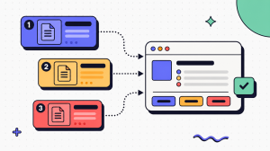
The goal is not more screenshots. It is fewer, better screenshots that resolve real moments of confusion. A useful image might show where a hard-to-find setting lives, what a screen should look like before an action, or how to confirm the task worked. If it does not make the instruction easier to follow, it is probably clutter.
This guide covers how to plan a screenshot-based user guide, capture and annotate useful images, write instructions around them, and keep the guide accurate as the interface changes.
Key takeaways
- Screenshot-based user guides work best when each image resolves a specific question about location, state, or confirmation.
- Plan the written steps before capturing screenshots so you only create images that genuinely help the reader complete the task.
- Keep screenshots focused, consistent, readable, and free of sensitive customer or internal data.
- Write instructions so they still make sense without the image, then use the screenshot to confirm what the reader should see.
- Treat UI changes as review triggers so outdated screenshots do not quietly undermine otherwise accurate documentation.
Why user guides need screenshots

Text alone forces the reader to translate a written label into a visual target. For simple tasks that translation is easy. For a crowded admin console with similar-looking menus, it is where people get lost. A screenshot removes the translation step by showing the exact target.
Visual instructions also match how people scan. Readers rarely read a procedure top to bottom. They jump to the step they are stuck on, and a well-placed image confirms they are in the right place before they act. That confirmation matters.
But screenshots are not free. Each one is a maintenance liability that has to be recaptured when the interface changes. The value of an image has to outweigh the cost of keeping it current. That tradeoff is the whole craft.
How screenshots improve task completion
Screenshots improve task completion when they reduce a specific moment of doubt. The common doubt points are location ("which of these five tabs?"), state ("is this toggle already on?"), and confirmation ("did that save?").
Consider a SaaS admin inviting a teammate and setting their permissions. The written step "open the Members tab and set the role to Editor" is clear until the reader sees four tabs that all look plausible. One cropped screenshot of the Members tab with the role dropdown highlighted resolves the doubt.
Research from the Nielsen Norman Group found that readers pay close attention to images that carry information and largely ignore images that are purely decorative. The lesson for documentation screenshots is direct: show the part of the screen that carries the decision, and cut the rest.
Doubt points a screenshot can resolve
- Location doubt: A cropped image of the exact menu or tab.
- State doubt: A close-up showing a toggle, checkbox, or status before and after.
- Confirmation doubt: The success message or updated screen after the action.
When screenshots help and when they add clutter
A screenshot helps when the target is hard to find, the state is ambiguous, or the consequence is easy to get wrong. It adds clutter when it repeats something the text already made obvious.
You do not need an image for "click Save" when there is one Save button on the screen. You do not need a full-page screenshot to show a single field change. And you rarely need a screenshot of a step the reader will perform dozens of times, like logging in.
Here is a simple test: if you removed the image, would the reader still know exactly what to do? If yes, cut it. If no, keep it and make it sharper. This same restraint is what separates clear work instructions from bloated documentation.
The keep-or-cut test
- Keep the screenshot when: the target is buried, the state is unclear, or the action is irreversible.
- Cut the screenshot when: the text is already unambiguous, or the screen is trivial.
- Replace with text when: a single sentence ("the Save button is in the top-right") does the job.
Planning screenshot-based user guides
Many weak guides are weak because nobody planned them. Someone opened the tool, started clicking, and captured whatever appeared. Planning first is what separates an illustrated user guide from a screenshot dump.
Planning does not have to be heavy. It comes down to three decisions made before you capture: who this is for, what the finished task looks like, and how each screen will look and be annotated. Make those decisions once and every later screenshot gets easier.
For a reusable structure to hang this on, you can lean on a simple guide skeleton rather than reinventing one each time. For deeper reusable formats, see our documentation templates guidance rather than building a template catalog here.
Define the audience, goal, and user journey
Start with the reader, not the screen. A guide written for a new customer needs more context than one written for an internal admin who already knows the product. The audience sets the reading level, the amount of explanation, and which steps you can assume.
Then define the single task the guide completes. "Manage billing" is not a task. "Update the credit card on file" is. A focused goal keeps the guide short and keeps your screenshot count honest.
Finally, walk the real user journey from the first click to the confirmation screen. Note where a real person would hesitate. Those hesitation points are exactly where documentation screenshots earn their place.
Three planning decisions
- Audience: Their role, tool familiarity, and what they already know.
- Goal: One specific, completable task stated as an outcome.
- Journey: The real click path, with hesitation points flagged.
Map each step before capturing documentation screenshots
Before you take a single image, write the steps as plain text. A text-first outline forces you to decide what actually happens at each step, and it exposes steps that do not need an image at all.
Mapping the workflow before capture also makes it easier to see which steps need visual support. For teams that prefer to capture the real workflow first and generate the documentation from it, see our guide to capture-first workflow documentation.
Next to each step, mark whether it needs a screenshot and why. If you cannot name the doubt the image resolves, the step probably does not need one. This is where screenshot restraint starts.
Mapping first also protects you when the UI changes. If your steps are written as actions ("open the billing settings") rather than as pointers to a picture ("click the blue button in the image"), the text survives a redesign even when the image needs recapturing.
Map the guide before capture
- List every step: Write the full click path as short action statements.
- Flag image needs: Mark each step as needs-image or text-only, with the reason.
- Note the setup: Record what account, data, and screen state each capture requires.
- Set the order: Confirm the steps run in the sequence a real user follows.
Create a consistent screenshot and annotation style
Inconsistent screenshots make a guide feel unreliable even when the steps are correct. Different crop sizes, mismatched highlight colors, and random zoom levels force the reader to reorient at every image.
Decide the style once and apply it everywhere. Pick a highlight color that stands out against the interface, a single annotation shape for "click here," and a standard crop width so images line up down the page. A capture-first documentation tool such as Haiku can generate step images in a uniform style automatically, which removes much of this manual consistency work.
Write these choices down as a short style note so the next person who edits the guide matches it. Consistency is not decoration. It is what lets the reader trust the images.
Style choices to lock in
- Highlight: One accent color and one shape (box or arrow) for the click target.
- Crop: A standard width and margin so images align and stay legible.
- Labels: A consistent font and placement for captions and callouts.
Capturing better screenshots for documentation
Capture quality is where good planning either pays off or falls apart. A well-scoped step still fails the reader if the image is blurry, cluttered, or full of the wrong data.
The aim is a screenshot that shows exactly the relevant region, at a resolution that stays crisp, with nothing on screen that leaks private information. Three habits get you there: prepare the screen, capture tightly, and redact by default.
Set up the interface before you capture
The screen you capture is the screen the reader trusts, so stage it deliberately. Use a clean test account with realistic but non-sensitive data. Close notification banners, unrelated browser tabs, and any half-finished states that would confuse the reader.
Set the interface to the exact starting point of the step. If the step is "change the role to Editor," open the screen with the dropdown ready, not three clicks away. The reader should see the same screen they will see when they follow along.
For product walkthroughs, use a consistent window size and zoom so every capture in the guide matches. A shifting viewport makes an otherwise correct guide feel sloppy.
Prepare the screen before you capture
- Use a test account: Realistic data, nothing personal or confidential.
- Clear the noise: Close banners, extra tabs, and unrelated panels.
- Set the state: Open the exact screen the step begins on.
- Lock the viewport: Keep window size and zoom identical across captures.
Use cropping, resolution, and highlighting effectively
Crop to the decision. A full-page screenshot forces the reader to hunt for the one element that matters. A tight crop around the relevant control tells them where to look before they read a word.
Capture at a resolution that stays sharp when scaled to the guide's column width. Blurry text in a screenshot is worse than no screenshot, because the reader may assume the fault is theirs. High-DPI (retina) captures scaled down usually look cleanest.
Then add one highlight, not five. A single box or arrow on the click target reads quickly. Three arrows, a circle, and two color overlays turn the image into a puzzle.
Before and after: a permissions screenshot
A weak version shows the entire settings page at full width, no highlight, with the role dropdown as one small element among many. The reader scans, gives up, and guesses.
The useful version crops to just the Members row and the role dropdown, scaled up so the labels are readable, with a single box around the dropdown. Same screen, but now the image does the work the text cannot.
Protect sensitive data in screenshots
Every screenshot is a potential data leak. Real customer names, email addresses, account numbers, internal URLs, and support tickets have all shipped inside published guides because nobody checked.
Redact by default. Blur or mask anything that identifies a person or exposes a system detail before the image goes into the guide. It is far cheaper to redact during capture than to recall a published guide later.
The W3C Web Accessibility Initiative guidance on images is also worth honoring here: never let an image be the only way meaning is conveyed. Anything critical shown in a screenshot should also appear in the text, both for accessibility and for the reader whose screen reader cannot parse the image.
What to redact before publishing
- Mask identities: Names, emails, avatars, and account numbers.
- Hide system detail: Internal URLs, tokens, and environment labels.
- Use safe data: Seed the test account with obviously fake records.
Writing instructions around screenshots for an instruction guide
Screenshots do not stand alone. The text is what makes an instruction guide survive UI changes, because words describe intent while images only describe a moment in time. Strong writing and strong images reinforce each other.
The rule is simple: the reader should be able to complete the step from the text alone, with the screenshot as confirmation. If the guide only works when the image is perfect, the guide is fragile.
Write action-oriented steps that match the image
Start each step with a verb and name the target the way it appears on screen. "Click Settings" beats "navigate to the configuration area" because the reader can match "Settings" to a label they can see.
Match the wording to the screenshot exactly. If the button says "Add member," do not write "add a user." Mismatched language between the text and the image is a common cause of confusion, especially for readers who scan.
Describe the target by name and location, not by its appearance in your image. "Open the Members tab" survives a redesign. "Click the blue button in the picture" breaks the moment the button turns green.
Rules for step wording
- Lead with the verb: Click, open, select, enter, confirm.
- Match the label: Use the exact on-screen wording.
- Name the location: Describe where it is, not what color it is.
Place screenshots where they reduce confusion
Position each image immediately after the step it illustrates, never before. The reader reads the action, then sees the confirmation, in that order. An image floating above its step makes the reader guess which instruction it belongs to.
Keep one image tied to one step. A single screenshot trying to cover three actions splits the reader's attention and usually highlights nothing well. If a step is genuinely complex, break it into sub-steps with a tighter image each.
Leave whitespace around images so the eye can separate one step from the next. A wall of stacked screenshots reads as a single blur, which defeats the point of illustrating the guide at all.
Keep captions, labels, and callouts clear
A caption should add information the image cannot show on its own, not restate the step. "The role dropdown, set to Editor" is useful. "Screenshot of the screen" is noise.
Write alt text for every screenshot so the guide works for readers using assistive technology and for anyone whose image fails to load. Describe the function shown, not the pixels: "Members tab with the role dropdown open" rather than "image."
Keep callouts short and consistent. One or two words on an arrow ("click here," "toggle on") is plenty. Long callouts crammed into an image become unreadable at the guide's display size. For the broader craft of documenting the underlying steps, see our guidance on documenting workflows, runbooks, and technical guides.
Keeping an illustrated user guide current
The hardest part of a screenshot-based guide is not making it. It is keeping it true. A guide is accurate the day you publish it and starts drifting the moment the product changes.
Manual guides drift silently. Nobody notices the screenshots are wrong until a user follows one into a dead end and files a ticket. This is one of the hidden costs of poor process documentation that surfaces long after the guide ships. How you produce the guide matters more here than how carefully you wrote it the first time.
The fix is a recapture habit plus a way to know when to trigger it. Set a review cadence tied to product releases, and flag guides that touch screens the product team is about to change. Capture-first documentation tools like Haiku reduce this burden by recording the real workflow once and regenerating the steps when the interface changes, which turns a full manual recapture into a quicker review. Manually assembling and cropping a ten-step guide can take significantly longer than recapturing a real flow, though exact time depends on the workflow and tooling.
Habits that keep a guide accurate
- Set a cadence: Review guides on a schedule and after major releases.
- Trigger on change: Recapture when the underlying screen changes, not on a guess.
- Review, do not rewrite: Confirm each image still matches, and replace only what moved.