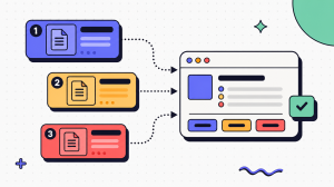
The failure happens at the exact moment someone gets stuck. They open your app or unbox your product, reach for the manual, and find a tour of every menu instead of the one task they came to complete. So they close it, search a forum, or contact support. When they later say the documentation was useless, they’re right.
The fix is simple: stop documenting features and start documenting tasks. A user manual shouldn’t describe everything a product can do. It should help one person complete one task at the moment they need it.
This guide is the end-user companion to our seven-step SOP framework. That guide explains how to document internal processes. This one focuses on documentation for customers and end users.
Key takeaways
- A user manual helps someone complete a task: set up a product, use it, or troubleshoot it. Its job is task completion, not documenting every feature.
- Plan around the reader’s goals, not your product’s menu structure.
- Write task-first in plain language: one action per step, clear verbs, and a visible sign that each step worked.
- Structure for scanning, not reading cover to cover. Most people open a manual in the middle of a task.
- Use screenshots only when they clarify a step, and keep them current. An outdated screenshot is often worse than none.
What Is a User Manual?
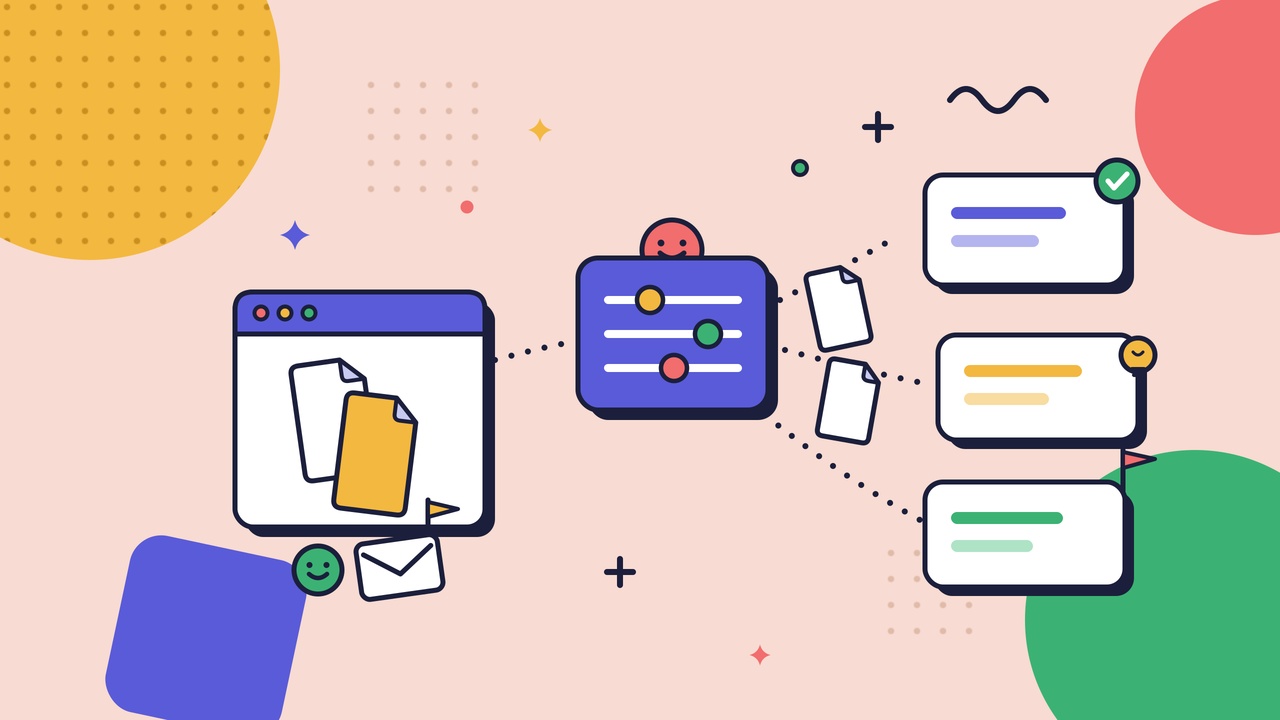
A user manual is end-user-facing documentation that helps someone complete a specific task: set up a product, use it, or troubleshoot it when something goes wrong. Its audience is the person outside your team trying to get something done, and its measure of success is task completion, not coverage.
It goes by several names: instruction manual, user guide, product manual, owner’s manual, or user documentation. The name changes, but the job doesn’t. Help a non-expert reach an outcome without asking for help.
Keep one boundary clear because it determines what belongs in the manual. A user manual helps an external reader use your product. A standard operating procedure explains how your own team performs an internal process. They are written differently because they serve different readers: one is a first-time user, the other is a colleague following an established process. If you’re documenting internal work, use an SOP. If you’re documenting your product for customers, you’re in the right place.
How to Plan a User Manual
Every unusable manual I've read was written before anyone decided who it was for or what it was supposed to get done. Planning is the cheap part that makes the writing possible. Five decisions carry it.
Name the reader, not "the user." "The user" is an average of nobody. Pick the least-experienced person who is actually allowed to do the task: the new customer or the first-day operator. Then write to them. Their vocabulary, not yours, sets the reading level. A word your team says fifty times a day is a word a stranger may have to look up.
List the jobs, not the features. Open a blank page and write the tasks a reader shows up to do: connect an account, replace the filter, export a report, recover a password. These are the sections of your manual. A feature list arranges the manual around how the product is built; a job list arranges it around why someone opened it.
Find the moment of need. Ask where the reader will be when they reach for this. Standing at a machine with one free hand? On a phone, mid-signup, slightly annoyed? That context decides length, format, and where a page has to be findable. Documentation gets read under load, not in a quiet room.
Set the scope, then defend it. Set the scope, then defend it. Decide what this manual covers and what it points elsewhere for. A manual that tries to explain everything hides the one thing the reader needs. When a task is really a separate process, link to it rather than re-teaching it. For repeatable internal procedures, that’s what our seven-step SOP framework is for.
Pick the spine before you write a sentence. Order the sections the way a reader progresses, not the way your settings menu is laid out: quick start, then common tasks, then the rarer ones and troubleshooting. The structure is a planning decision. Make it on purpose, once, before the prose starts.
How to Write User Documentation
Once you know the reader and the tasks, the rest comes down to a few simple rules. They all serve the same purpose: preventing the reader from taking the wrong action.
Lead with the task, not the interface. Start with the outcome: “To reset your password,” not a description of the settings screen. The reader came with a goal. Meet them there, then guide them to the button.
Write for the reading level of a stranger. Plain language isn’t dumbing things down. It’s respecting a reader who is busy and unfamiliar with your product. Use short sentences, common words, and one idea per sentence. Cut anything that doesn’t help someone complete the task. They didn’t come to admire your feature. They came to use it.
One action per step, with a verb they can perform. One action per step. If a numbered step contains an “and,” you’ve probably combined two actions. Split them. Start each step with a verb and, where it matters, say what success looks like: “Click Export. The file downloads to your Downloads folder.” Avoid vague verbs like verify, ensure, and make sure. Tell readers what to do instead. For more on sentence-level instruction writing, see our guide to writing clear work instructions.
Name one thing one way. If it's the "dashboard" in step 2, it isn't the "home screen" in step 6. Synonyms feel like good writing and read like two different features. Consistent terminology is a usability feature, not a style preference.
Say what "done" looks like. Every task should end with something the reader can verify: a green checkmark, a confirmation email, or a solid status light. Without it, two people can follow the same steps and still disagree about whether they succeeded.
User Manual Structure and Formatting
A manual is not read from page one. It is opened to a page. Structure and formatting determine whether the reader finds what they need before they give up.
Give the manual a spine a reader can predict:
- Quick start first. Put the task most readers came to complete at the top. If they have to dig for it, they’ll look elsewhere.
- Task sections next. One section per job, named for the job ("Add a team member," not "User Management"), ordered from most to least common.
- Reference and troubleshooting last. Put settings glossaries, edge cases, and troubleshooting at the back, where readers who need them will look without slowing everyone else down.
Then format each page to be scanned under pressure:
- Number sequential steps; bullet everything else. Numbers promise sequence. Use them only when order matters.
- Put the action first and warnings before the step. A warning that comes after the action comes too late.
- Chunk with headings and whitespace. Dense pages get skimmed, and that’s where steps get missed. Descriptive headings help readers jump to what they need.
- Make it findable. A table of contents, search, and cross-links matter more than any single sentence. The best-written step is useless if readers can’t find it.
Write every page as if it's the first one the reader will see. One of them is.
Adding Screenshots and Visuals to User Manuals
Some things don’t survive being written down. Which of three near-identical buttons to click, what the screen should look like when it’s right, or where one part sits relative to another. The moment a reader has to rebuild that picture from a paragraph, the step becomes fragile. That’s exactly where a visual earns its place.
Two rules keep visuals useful, and a third keeps them current.
Annotate, or don’t bother. A raw screenshot says, “somewhere on this screen.” An arrow, a highlight, and a one-line caption say, “here, this, because.” An unannotated image isn’t documentation; it’s a picture the reader has to interpret.
Crop to the decision. Show the part of the screen the step is about, not the whole desktop. The more you show, the more the reader has to search.
A stale visual is worse than none. An old screenshot of a redesigned UI teaches the wrong action with the authority of an image. The quiet reason manuals rot is that refreshing visuals by hand is expensive, so it doesn’t happen. We’ve measured the tradeoff across documentation work: 90 to 120 minutes to rewrite and re-illustrate a procedure by hand, compared with 8 to 15 minutes to recapture it.
When updates are cheap, manuals stay accurate. When they’re expensive, screenshots slowly become lies. That’s the case for capturing a workflow by doing it instead of typing it up.
Stills are the right tool when the challenge is spatial. When the challenge is motion, such as a drag or a sequence you can’t freeze, a still can’t capture it, and that’s where a short recording takes over. For everything a frozen frame can carry, keep it frozen: it loads instantly, it prints, and the reader can hold their place.
User Manual Examples and Templates
The easiest way to see the difference is to look at two good examples. Both examples follow the same structure. Most good user manuals do too.
SaaS product guide
Take “Connect your first integration.” A feature-first version opens with a paragraph about the integrations platform and its architecture. A task-first version starts with the outcome and the steps: go to Settings → Integrations, select the tool, click Connect, approve the permissions, and confirm the status badge reads Connected.
Add one annotated screenshot at the permissions screen, because that’s where readers usually hesitate. Include a short troubleshooting note for the error readers are most likely to hit. Nothing about the platform’s design philosophy.
Hardware manual
Take “Descale the coffee machine.” The reader is standing at the counter, so the section starts with what they need on hand (descaling solution, water, an empty carafe), followed by numbered steps with visible checkpoints.
For example: “The light blinks amber while descaling and turns solid green when the cycle finishes.” Add a cropped photo showing the correct reservoir, because “the tank” is ambiguous when there are two. Put the warning (“Do not interrupt the cycle”) above the step it protects, not below it.
Both examples follow the same pattern. Most good task sections do:
- Title: Named for the task, in the reader’s words.
- Purpose: One line explaining when and why they’d do it.
- Prerequisites: What they need before step one.
- Numbered steps: One action per step, with a completion criterion.
- Visuals: Only where words become fragile; annotated and cropped.
- Troubleshooting: The two or three failure modes that actually occur.
- Related tasks: Where to go next.
A template only helps if it survives the product changing underneath it. Anchor each step to what it accomplishes and the stable landmark nearby, not to a button label that may move in the next release. That’s the approach behind templates built to survive interface changes. Build the structure once, and every new section starts three-quarters written.