New users often get stuck not because the documentation is missing, but because they have to keep switching between instructions and the product itself.
Interactive product guides close that gap by letting users learn while completing real tasks inside the application. This guide explains what interactive product guides are, how they differ from static user guides and video, and how to plan, build, and measure them. For the broader onboarding tooling decision, see our guide to employee onboarding software.
Key takeaways
- Interactive product guides help users learn by completing tasks inside the product instead of reading or watching instructions separately.
- Use interactive guides for first-time, multi-step workflows where task completion matters more than explanation.
- Keep each guide focused on one user goal and one outcome to improve completion rates.
- Review interactive guides regularly because UI changes can quietly break walkthroughs.
- Measure guide success by completion, feature adoption, and drop-off points rather than views alone.
What Are Interactive Product Guides?
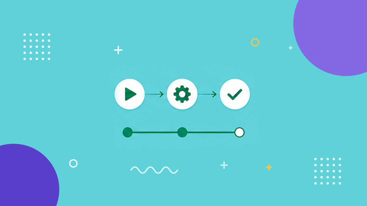
An interactive product guide is a step-through walkthrough that runs inside your product and advances only when the user completes each action. The reader does not scroll or press play. They click the real button, fill the real field, and move forward by doing the task.
That is the core distinction. A static user guide asks you to read and then go do it somewhere else. A demo video asks you to watch and remember. An interactive guide combines reading and doing into one motion: the instruction and the action happen in the same place, at the same time.
One reframe is worth holding onto. The goal is not a prettier guide. It is a guide the reader can finish by doing. Interactive guides succeed or fail on completion, not on production value.
How Interactive Product Guides Differ from Static User Guides
Static user guides and interactive guides answer the same question, but they put the work in different places. A static guide front-loads the reading and relies on the user transferring it correctly to the live product. An interactive guide removes the transfer step.
A simple test: if the user has to switch between a document and the app to follow along, the guide is static. If the guidance lives on top of the app and reacts to what the user does, the guide is interactive.
Where each format fits
- Static user guides: Best for reference material the user returns to out of context, like policy details or a full feature index.
- Video product tutorials: Best for showing a flow the user cannot yet touch, or for concepts that need narration. Passive, but useful for the "why."
- Interactive guides: Best for the first time a user performs a real, multi-step task and needs to succeed at it, not just understand it.
Screenshots and video are not the enemy here. They are the passive contrast. For deep coverage of watch-based and read-based formats, route to the dedicated guides on writing clear work instructions rather than duplicating them.
Common Types of Interactive Guides
Interactive guides come in a few recurring shapes, and most teams end up combining them. What they share is that the user drives the progression.
Interactive guide formats
- Guided walkthroughs: A sequence of steps that advances as the user completes each action, suited to first-run setup.
- Tooltips and hotspots: Contextual prompts anchored to specific UI elements that explain a control the moment the user looks at it.
- Checklists: A visible task list that tracks progress across a longer onboarding journey and lets the user resume where they left off.
- In-context tutorials: Task-specific flows triggered when a user reaches a feature, so the guidance arrives when it is needed.
Benefits of Interactive Guides for User Onboarding
The core benefit is not engagement for its own sake. It is that active practice tends to retain better than passive watching. When a user performs the task once under guidance, they have already begun building the recall needed to repeat it alone. A video watched last Tuesday does not offer that.
That principle, active learning aiding retention, has substantial support in education research and applies to product adoption as much as to any other skill. The value tends to show up in two places operators can measure. Teams building richer flows often pair guides with interactive employee training tools to reinforce the same active-learning principle.
Faster Time to Value for New Users
Time to value is the gap between a user signing up and getting the thing they came for. Static documentation can stretch that gap because the user has to read, interpret, and then attempt. Interactive guides shorten it because the first attempt is the lesson.
Consider a new SaaS admin setting up user provisioning in a fresh console. A static guide sends them to a doc, then back to the console, then back to the doc when a field name does not match. An interactive walkthrough steps them through provisioning inside the console itself, so the account is configured correctly on the first pass. They reach value during the guide, not after it.
Reduced Support Tickets and Churn
Every support ticket for a "how do I" question is a guide that did not exist or did not get followed. Interactive guides intercept those questions at the moment of confusion, which tends to lower ticket volume for repeatable tasks.
Take a customer success team that fields the same request constantly: reset a customer's multi-factor authentication (MFA). Turned into a click-by-click interactive guide, that task can become self-serve. The customer completes it in the product, the ticket never gets filed, and the CS team spends its time on the judgment work that requires a person. Fewer stuck users early can also mean fewer quiet cancellations later, though churn has many causes beyond onboarding friction.
Planning Interactive Product Guides and Onboarding Guides
Good interactive guides are planned before they are built. The trap is jumping straight into a tool and recording every click you can find. That produces a bloated guide nobody finishes. The goal is not to guide every feature. It is to guide the few tasks that decide whether a user stays.
Plan in three passes: define what success looks like for the user, map the features that lead there, and only then pick the format and tool.
Defining User Goals and Journey Stages
Start with the user's goal, not your feature list. A user does not want to "learn the dashboard." They want to invite their team, connect a data source, or ship their first output. Name those outcomes, then place them on a journey: first session, first week, first month.
Different stages need different guides. The first session needs a short walkthrough that reaches one clear win. Later stages can layer in the deeper, less urgent tasks. Onboarding guides that try to teach everything on day one tend to teach nothing. If speed is your priority, our playbook on how to onboard employees faster covers the same staged approach.
Mapping Key Features to Guide Steps
Once you know the goals, map the minimum path through your product that reaches each one. This is where most teams over-build. A feature existing is not a reason to guide it.
Mapping the guide path
- List the outcome: Write the concrete result the user wants, such as "first report published."
- Trace the shortest path: Note only the clicks strictly required to reach that outcome, skipping optional detours.
- Cut the nice-to-haves: Remove any step that does not block the outcome; those belong in reference docs, not the walkthrough.
- Sequence the steps: Order the remaining actions exactly as the user will perform them live.
Choosing the Right Guide Format and Tools
Format follows the task. A one-time setup wants a guided walkthrough. A cluster of small "what does this do" questions wants tooltips and hotspots. A long, multi-session ramp wants a checklist that survives interruptions.
The harder question is authoring and maintenance, which is where many interactive guides quietly fall out of date. This is the drift problem, and it deserves its own honesty in the next section.
Creating Interactive Product Tutorials
Building the guide is the part teams expect to be hard. It is usually the part that goes fine. The step that gets skipped is the review pass that makes the guide accurate, and the maintenance that keeps it accurate after the UI changes.
The central risk of any interactive guide is drift. Your product changes. A button moves, a field gets renamed, a step gets added. The moment that happens, a hand-authored guide points at something that is no longer there, and the user hits a dead end mid-task. A guide that breaks silently is arguably worse than no guide, because the user trusted it.
This is where authoring method matters more than any single feature. Traditional guide-building means someone re-records or re-writes the walkthrough every time the interface shifts, which is why so many libraries fall out of date. A capture-first tool inverts that: you record the real workflow once, and change-detection flags the steps that no longer match when the UI changes, so you regenerate instead of rebuild. For how that approach works in practice, see our guide to capture-first workflow documentation.
Writing Clear, Actionable Step Content
Each step should say exactly one thing to do, in the imperative, anchored to what the user sees. "Click Settings in the left sidebar" beats "Navigate to your configuration options." Vague instructions force the user to interpret, and interpretation is where guides lose people.
Step-writing rules
- One action per step: Never combine two clicks into one instruction; each screen change is its own step.
- Real element names: Use the exact button, tab, or field label the user will see on screen.
- Verb first: Start with the action word so the user knows what to do before why.
- Result confirmation: Tell the user what should happen after the action so they know they succeeded.
That last rule matters more than it looks. When a step tells the user what they should now see, and they see it, they trust the next step.
Designing Tooltips, Hotspots, and Walkthroughs
Placement is the whole game with tooltips and hotspots. A tooltip that covers the button it describes is a defect. Anchor each prompt beside the element, not on top of it, and trigger it when the user's attention is already there.
Keep walkthroughs short. A walkthrough that runs past a handful of steps in one sitting risks losing people before the payoff. If a task genuinely needs many steps, break it into a checklist the user can pause and resume, rather than one long forced march.
Testing and Iterating on Your Tutorials
A guide is not done when it is built. It is done when someone who has never seen it can finish the task by following it. Run a no-context dry run: hand the guide to a person outside the team and watch where they hesitate.
Every hesitation points to a defect in the guide, not in the user. Fix the step rather than blaming the tester. Then test again after every meaningful UI change, because the guide that worked last quarter may point at a button that moved.
Measuring Guide Engagement and Effectiveness
You cannot improve a guide you do not measure. But measure the right thing. A guide with high views and low completion is not a success. It is a failure with good traffic. Coverage without completion is guide theater.
The two questions worth answering: are users finishing the guide, and are they succeeding at the real task afterward? Everything else is secondary.
Key Metrics: Completion, Drop-off, and Adoption
Metrics that tell you if a guide works
- Completion rate: The share of users who start the guide and reach the final step. Low completion often means the guide is too long or a step is broken.
- Drop-off point: The specific step where users abandon the guide. A cluster of drop-offs at one step is a precise repair instruction.
- Feature adoption: Whether users who finished the guide keep using the feature afterward. This is the strongest evidence the guide worked.
- Time to completion: How long the guided task takes, useful for spotting steps where users stall.
Using Analytics to Optimize Guides
Analytics turn vague dissatisfaction into a specific fix. A drop-off spike at step four is not a mystery. It points to a step that needs rewriting or a UI element that moved. Read the numbers, repair the exact step, and re-test.
The loop is simple: ship, watch the drop-off data, fix the worst step, repeat. Guides that run this loop tend to improve steadily. Guides that ship and are forgotten decay quietly until someone notices the completion rate has dropped. For how AI is changing this measure-and-maintain work across documentation, see our overview of AI process documentation use cases and ROI.